
Urban Processing: some ideas
I think urban processing is cool. The right photo, with the right "gritty" editing, looks modern and eye-catching. I guess it’s not to everyone’s taste, but I love it.
There are various tutorials and actions available to give your photos an "urban" look, but not every photo responds desirably to these standard methods, and anyway, do you really want your photos to look the same as everyone else’s? You’d like your portfolio to be unique and memorable.
I’d like to share two simple methods for you to try. Two methods, but infinite variations – no two photos will ever look the same.
(The trouble with not being a photographer myself is that I don’t always have a ready supply of images with which to illustrate tutorials. Therefore, I am indebted to Beth Ritchie, Danielle Mavrick and Kristen Parker for their permission to use the lovely photos herein.)
The Preparation
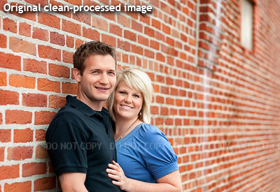
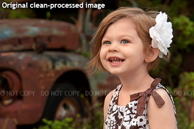
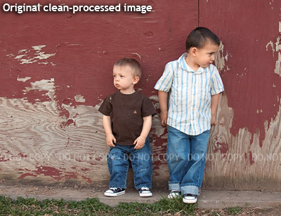
Artistic effects such as urban processing should be used to enhance good photos, not disguise bad ones. Therefore, it’s a good idea to do your regular clean processing first, and make the photo look lovely and natural. In the screenshots that follow, you’ll see that I’ve performed my clean edits first, and grouped them into one layer group for convenience. (More info.)
Method 1: Gradient Map
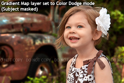
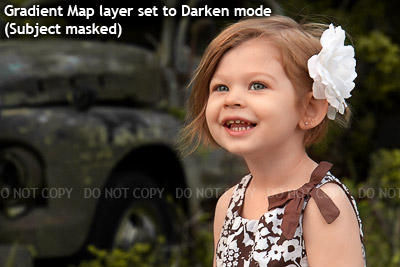
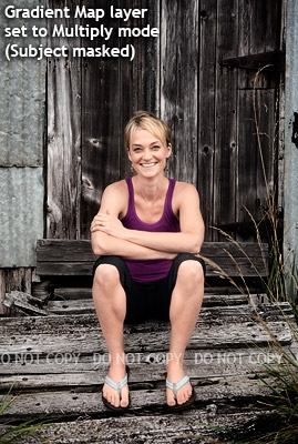
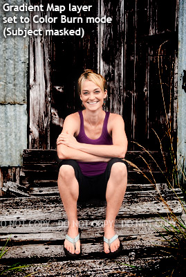
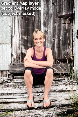
Many of you will be aware of the Gradient Map adjustment layer as a method of converting your photos to black-and-white. Not so many of you would have dabbled with a Gradient Map layer’s blend modes. Well, there’s a whole lot of fun hidden in there!
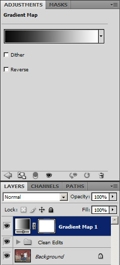
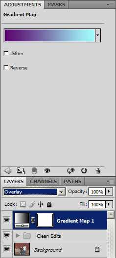
First, make your Gradient Map adjustment layer in the usual way. This will turn your image to black-and-white:
Then, simply try out each of the layer blend modes in the Layers Panel:
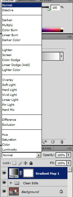
Some blend modes will be awful, some will do very little, but I guarantee you’ll find one or two gems in there for each photo, that’ll make you say "wow!".
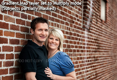
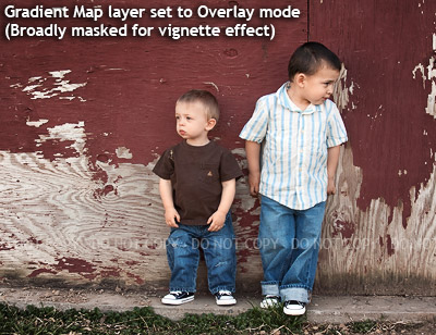
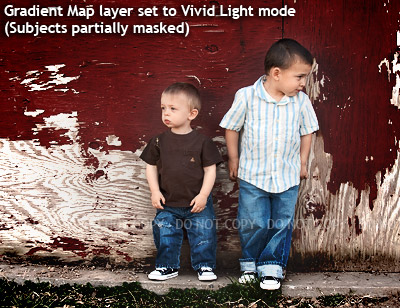
Of course, artistic processing doesn’t always look good on skin. So after you choose a great effect, you’ll need to decide if you want to remove it from the skin, or other parts of the photo. Your Gradient Map layer already has a mask attached, so simply paint with black over the areas which need to be masked. I recommend using a brush at about 20% opacity, and gently paint away the effect with subtle finesse.
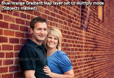
Let’s take a look at some examples …
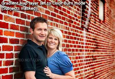
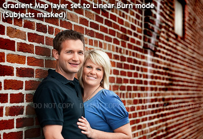
You’re not restricted to a black-and-white gradient map, either.Once you start playing with coloured gradients, whole new worlds open up!
Neat, huh?
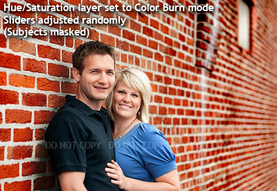
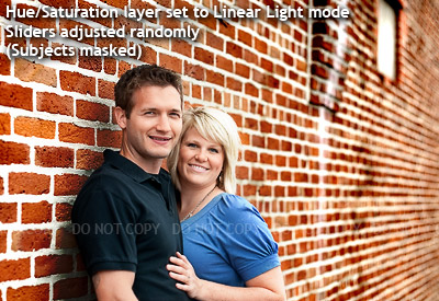
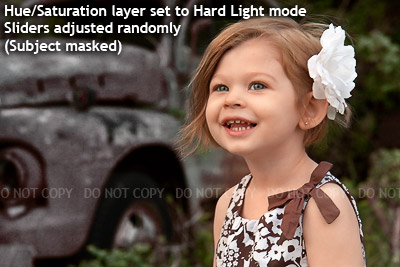
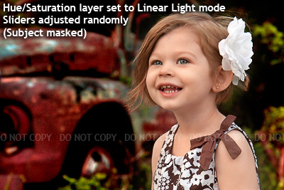
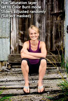
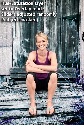
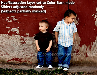
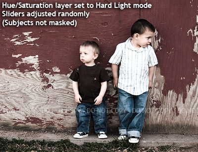
Method 2: Hue/Saturation
This method involves layer blend modes too, but it also involves some random slider-jiggling on your part. It takes a little longer, because there are more variables, but the results are unexpected and exciting!
Start by making a Hue/Saturation adjustment layer, then choose a blend mode:
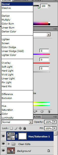
I’ve found that Color Burn, Hard Light and Overlay modes often give great results, but you’ll have fun trying almost all of the modes.
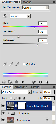
Once you’ve chosen a blend mode, start playing with the Hue, Saturation and Lightness sliders:
More advice than that, I can’t give you. It’s just a matter of playing, and enjoying surprising results. Every photo will behave differently.
As I described earlier, once you’ve found a charismatic effect, you can mask it away from your subject as much or as little as you desire. Here are some examples:
Have fun!