
Case study: Bright red clothing
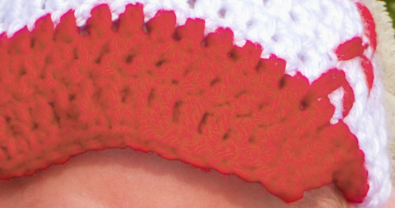
Thanks to Chasity from Ohio for allowing me to use this gorgeous photo in this post.
This article relates to my previous Strategies for managing out-of-gamut clothing post, which I suggest you read first if you haven’t done so already.
Red clothing is a hassle, isn’t it. Well, any vivid-coloured clothing can be, but red seems to plague us most often. Check out this photo. That red outfit is as cute as all get-out, and so wonderfully bright! It makes you swoon (although it also burns a cyan imprint on your retina if you look at it for too long!).

But there are two problems. Inter-related problems, but different.
The first is that there’s channel clipping. Not just at the bright end of the red channel, but also at the dark end of the green channel. See the two severe spikes at the ends of the histogram?
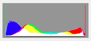
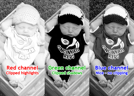
Here is a view of all three channels. Both the red and green channels are clipped:
"So what?" you might say. "So it’s clipped – big deal. I still love it."
Well, I love it too. I don’t mind a bit of clipping in my images, if the circumstances call for it.
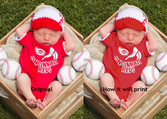
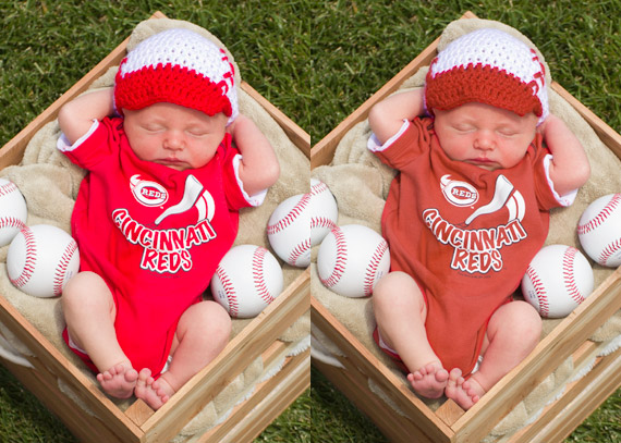
But here’s the second problem – print gamut. Your lab (almost certainly) can’t print reds as bright as your screen can show them, so the colour dies another death when it hits paper.
Here, I’ve soft-proofed the photo using WHCC’s lustre profile. This is how it would print. You can see that the red is duller, and somewhat darker. Most significantly, there’s no shape to it. It’s pretty much just a blob of flat red:
Read about soft-proofing here if you need to. In that article, I wrote about:
"the perpetual trade-off when dealing with out-of-gamut areas … you can have the brightest possible colour with no detail, or duller colour with correct detail. Your choice!".
So, we come to a fork in the road. To our left is the "Meh, I don’t care if it’s flat and shapeless; I’ve got to get this job done in a hurry, and I’m not charging much for it" route. On occasions when you want to take that easy path, don’t bother reading any further. Just send it off to the lab, and get on with your life.
To our right is the "Let’s do our very best to get a good print" road. This route involves massaging the out-of-gamut colours into the print gamut, so that they’ll be identical between screen and print. And yes, it’ll mean duller colours. But they’ll be duller colours with visible detail, which is important to a nerd like me.
So, here’s what I do. Take a look at the one on the right:
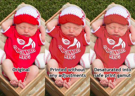
I’ve desaturated the red clothing until the colours are all within gamut. That is, when I toggle my soft-proof profile on and off, there’s no change (well, not enough to worry about, anyway).
I hope you can see on your screen what I can see on mine. I see a duller red, but I see the folds and creases and undulations of the fabric, that aren’t visible on the printed (middle) one.
See what I mean about making a choice? Because I’m a raving nerd, I prefer the desaturated one. I value shape and detail over in-your-face brightness. However, your opinion may well differ from mine, and that’s absolutely fine. This is one of those little tiny aspects that form part of your style. If your style is rich colour, then go with it.
By this point in the article, I expect only my fellow nerds are still reading. Solidarity, comrades!
So are we, the nerdiest of the nerds, happy with the outcome of this image? Well, actually, no. When we look closely at the detail, it’s still … "mushy", isn’t it?
Nerds don’t just want a bit of detail. We want all the detail, dammit! And the above close-up doesn’t satisfy us. So, what’s the problem? Well, it comes all the way back to the clipping. Channel clipping, by its very nature, means that detail is lost.
Let’s look at those channels again:
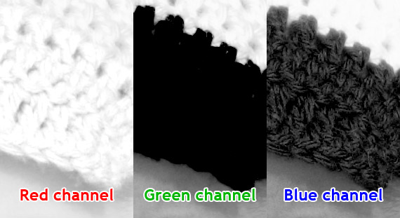
The red channel has got maybe half of its detail, and the green channel has none at all. Only the blue channel is showing proper detail. So really, when you add it up, the fabric really only has about 50% of the visible detail that it should have. It doesn’t surprise us, then, that when we desaturate into print gamut, the results are only about half as good as we’d like.
What does it all mean, Oh Nerdy One? Well, it means this: if we want the best possible detail in our prints, we have to avoid channel clipping first and foremost. By "first and foremost", I mean when processing our raw file.
Take a look at this one. The one on the left is the original clipped file, for reference. The one on the right has been desaturated to within print gamut from a non-clipped version of the raw file:
Look at that beautiful result! Look at those lovely folds and creases and undulations and detail in the red. And all printable!
Wanna see a close-up of that? Here’s a comparison between the previous attempt and the no-clipping version:
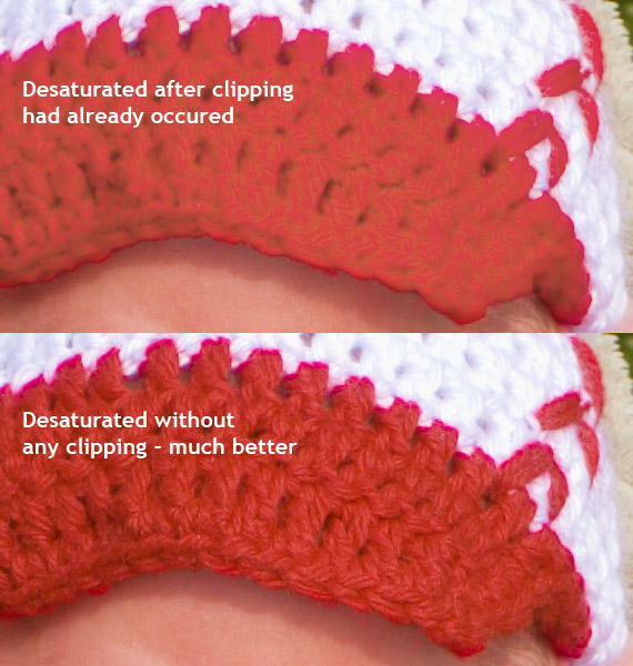
Look at that gorgeous detail. Perfectly visible, perfectly reproducible. Nerdvana!
How did I achieve it? Well, take another look at the Strategies article. Options 2, 3 and 4 are all perfectly legitimate ways to approach this situation.
As it happens, I used Option 4 for this demonstration (it was the easiest way to capture all the screenshots you’ve seen). In my normal editing, I use Option 3 almost every time, because I’m old-school. Folk who are more modern and hip than me might prefer Option 2.
Why have I written this article?
Well, I’ve seen this issue discussed a few times over recent days, and have been alarmed by two recurrent misunderstandings:
- "I just add a Hue/Saturation layer and desaturate it a bit – that fixes the clipping". No, as we’ve seen, it doesn’t. Well, it kinda does, but not very well at all.
- "I just add a Levels layer and pull in the output sliders a bit – that fixes the clipping". Nope, sorry. It’s an even less successful “solution” than the desaturating. It does absolutely nothing to recover detail – it just makes things flatter.
Clipping can’t be fixed after it’s happened. You have to go back to wherever it occurred (usually back to the raw file) and fix it at the source. Like in a time-travel movie where the hero goes back in time to stop something bad from happening before it actually happens … if you know what I mean.
Elements doesn’t have soft-proofing. What can Elements peeps do?
I wish I had a great answer to that, but I don’t. All I can tell you is that you’ll get a "feel" for how bright is too bright to print, after a while. How do you develop that instinct? Only by getting prints done, I’m afraid. It’ll cost you a few bucks in test prints and reprints, until you get in the zone.