
Spyder5Pro calibration tutorial – Macs & laptops

This tutorial discusses using the Spyder5Pro to calibrate screens which have no adjustability other than their brightness. This includes:
- All Macs
- All laptops
- Those all-in-one PCs that are trying to be Macs
- Very cheap desktop screens with no buttons or menus to control their colour
Before you begin, please make sure you’ve read this article.

Not your first time?
If you have previously successfully calibrated with this device, and now you just need to do the monthly recalibration, scroll down to the Monthly Calibration section at the bottom of this page. But if this is your first time, read on …
Part 1: Brightness
The Spyder5Pro helps you control the brightness of your screen, but in a kind of unintuitive way. I’ve done some testing and experimentation, and I’ve found that the best approach is to adjust the brightness manually before you start your first ever calibration.
Warm up
Make sure your screen has been turned on for at least half an hour before starting this process.
Light
Make sure you’re in good light. Viewing prints in dim light is a futile exercise. It needs to be bright enough, and white enough. Read this if you haven't already done so.
Adjust brightness to match prints
Compare your prints to your screen, and adjust the screen’s brightness to get an acceptable match. Remember, don’t hold the print close to the screen – it must be out to the side, so you have to turn your head to compare.
Please don’t agonise over this brightness step. Near enough is good enough.
If you’ve never adjusted the brightness of your screen before, it’s likely to seem horribly dim to you at first. Don’t worry, you’ll be used to it in no time at all, and you’ll wonder how you ever tolerated it so bright before.
Part 2: Install software
Calibrators no longer ship with disks. That’s fine, because the disks always used to be out of date before we got them anyway.
So when you open the box, the first thing you see is a notice to visit the DataColor website to download the software.
I don’t anticipate you’ll run into any problems during this process. You’ll be guided through download, installation, plugging in the device, entering the serial number, and activating the software. Finally, the software will launch for you, in readiness for your first calibration.
Part 3: Setup
Preferences
As soon as the software launches, choose Preferences from the Go menu:

Set the Recal warning for "1 Month", then click the “Advanced Settings” button:

"Check for software updates" should be turned on by default. "Share calibration data" is up to you. "Netbook controls" are only if needed, of course.
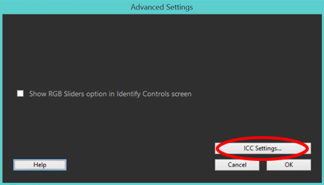
The "Show RGB sliders" box should remain unchecked. Click the "ICC Settings" button:
At the time of writing this, Version 4 profiles are still flaky. Make sure yours is set to Version 2:

Press OK a bunch of times to get back to the main welcome screen.
Welcome
On the main Welcome screen, you can check all four boxes, because we already discussed these issues at the beginning of this article:

If this isn’t your first time running the software, those checkboxes might not even be there at all! It seems to only ask you to check them on the very first time. That’s weird, but whatever.
In the "Display Controls" section, please ignore the first two instructions about Contrast and Color Temperature. They don’t apply to your screen. The third point, about Brightness, is very relevant, but we already addressed it in Part 1 of this tutorial.

When you’ve ticked all four boxes, press Next:

Display Type
I don’t know why this page even exists – there’s no difference in the calibration process either way that I can tell. Anyway, choose the display type most relevant for your computer, then press Next:

SPECIAL NOTE: On every screen, on the right-hand side, there’s a handy help panel. It’s great, and if you want even more in-depth explanation, you can click on the link at the bottom:

Make and Model
As far as I can tell, this screen is only relevant if you chose to share your calibration data with DataColor. Anyway, go ahead and enter your computer’s details:

Calibration Settings
This screen is the hub of the whole operation:

The Gamma must remain on 2.2 (no matter what out-of-date information you might have heard about Macs requiring a 1.8 gamma):

For Macs and laptops, 6500K shouldn’t be your White Point (not at first, anyway). Choose Do Not Adjust instead:

This is where it gets confusing Even though you’ve already adjusted the brightness, choose Adjust here:

No confusion with this one. Leave it off:

… aaaaaaand press Next:
Part 4: Lights out
At this point, if you haven’t already, turn off the lights or pull the blinds, or whatever. For your best chance of accurate calibration, make your room as dark as possible.
Part 5: Calibration
Tilt the screen back, and use the counterweight on the cord to hang the sensor over the back, so it’s positioned roughly on the diagram on the screen.


Yes, yes, I know this photo is of the Express, not the Pro. I was too lazy to take a new photo. So sue me!
Click "Next" to begin the calibration process.
Brightness
The device will take a minute to read black, red, green, blue and white. Then it will pause here:

At the top it will tell you the Target brightness is 120. This is a nonsense in-built target which is too high for everybody, and I wish Datacolor would wise up and change it.
If your screen matches your prints at 120, your office must be lit by football stadium floodlighting, and your power bill must be horrendous!
Don’t worry, what we’re doing here is setting a new target, based on the adjustment you made to your screen before we started.
So your Current brightness reading should definitely be lower than 120. You can see mine is at 98, because my office is quite well-lit. Generally speaking, yours should be between 70 and 100. If so, press "Continue" right away:

BUT … if it’s lower than 70 or higher than 100, I’m sorry, but I kinda need you to stop here, turn your light back on, and go right back to the start, and re-visit your print matching from Part 1. In good light, you really should have a print match somewhere between 70 and 100.
If you can’t be bothered starting over, adjust your screen’s brightness until it’s at approximately 80. That should be a safe area for most people.
IMPORTANT: Don’t forget to hit the "Update" button if you make a brightness adjustment. It will take a moment to re-read, then show you the new number.

Press "Continue" to move on:
Profiling
For about 2-4 minutes, your screen will display a whole range of colours while the device reads and records them:

NOTE: Please wiggle your mouse every few seconds while calibrating. It’s probably completely unnecessary, but do it anyway. The last thing you need is for your screen to dim itself from lack of activity after a minute or two – that throws the whole calibration into a cocked hat, believe me. Of course, don’t let the mouse pointer go underneath the device – just keep it at the side.
Once the Spyder has taken all its measurements, remove it from the screen, and press "Finish":

New target notification
Upon finishing, you’ll almost certainly get this little pop-up:

Don’t be alarmed – it’s a good thing. It’s telling you that your new Brightness target has been recorded in the software, where it will be remembered for you for all subsequent calibrations.
Part 6: Save the profile
On this screen, the Calibration Reminder period should already be set to "1 Month", because you set it in Preferences earlier.
By default, the profile name field will automatically populate with your computer name, and "-1" at the end. If you allow this naming convention, it will add "-2" when you recalibrate next month, and "-3" the month after that, and so on.

I do not agree with this default setting. There’s really no need to keep old profiles from previous months. So I recommend dropping the "-1" off the profile name:

And each month, use the same file name and save over the old profile. It’s a simple measure to prevent clutter on your computer.
Of course, there’s no hard-and-fast rule about this. You can call your profile anything you like, as long as you remember what it was.
Once you’ve named it, press Save:


Part 7: Lights up
Turn your lights back on, or open the blinds, or whatever.
Part 8: The comparison
Here, Datacolor gives us a grid of images to assess the calibration. It’s a completely pointless grid, because we don’t have those prints, do we? To assess the calibration, we need images that we can compare to prints. So immediately press the "Open Custom" button:

One at a time, you can open your print files and compare the screen to the prints. Here are a couple of examples of photos I used:


I wish there was a way to flick between your files more quickly – unfortunately, I haven’t found one. So allow a few minutes to go through all your files a few times, while holding their corresponding prints out to the side, and assess the result of the calibration. Don’t rush this part – take your time.
I have found, however, that you can drag-and-drop your image files from their folder onto the Spyder screen, which does speed things up a bit.
Note 1:
Remember that if any of your photos have extremely vivid colours in them (eg a bright turquoise dress, or a glowing orange sunset) those colours might be unprintable, and should be ignored when assessing calibration. Concentrate on the "normal/everyday" range of colours instead.
Note 2:
Please let me reiterate – have some tolerance. Calibration isn’t some kind of magic. It can never make ink on paper exactly match light coming from a screen. "Acceptably close" is what we’re aiming for.
Note 3:
On the right-hand side of the screen there’s a "Switch" button which shows you the difference between the uncalibrated and calibrated state of your monitor. This might seem handy at first glance, and it’s fun to toggle for curiosity’s sake, but the truth is it has no relevance to the task of print comparison, so don’t spend too much time playing with it.

How is your calibration?
If you’re satisfied with your print match, jump to the Finish section below.
However, if you would like to explore more options to see a closer match can be achieved, read on …
Part 9: Troubleshooting
First, consider your light
Please never underestimate the impact your surrounding light has on this calibration/comparison process. If your light is too dim or too yellow (both VERY common problems) it will always make your prints seem darker and/or yellower than they really are, and cause you to think that your screen is too bright and/or cold.
If you think, or even suspect, that your light is the culprit, take steps to rectify it. Get brighter/whiter bulbs if you can, or at least try assessing your prints in daylight. I would hate to be wasting your time with all of these calibration adjustments if the calibration wasn’t actually the problem.
If you’re sure the light is ok, read on …
Let’s try again
Pull down the little menu in the bottom left corner of the screen, and choose "Calibration":

That brings you to this screen:

Choose "FullCAL", then press "Change Settings":

… which brings you back to this familiar screen:

Here, you can choose your new targets for a different calibration.
Choosing new targets
Brightness
Even though you adjusted brightness before commencing, you might find that you’re not entirely happy with the brightness level you chose.
In that case, re-adjust the brightness for a better print match, then choose "Adjust" again:

You might be thinking "Really? I have to recalibrate after tweaking the brightness?" Yes. The calibration process creates a profile which is an exact description of the characteristics of your monitor at that point in time. If you adjust anything, the profile isn’t relevant any more.
Colour
Since your screen itself doesn’t give you any flexibility, you have to explore the only available avenue – the white temperature targets of the Spyder. Remember how we chose "Do Not Adjust" the first time? Well, now you have to try some of the other options, to see if any of them give you a better print match.
Generally you’d try 6500K first:

But if you know your screen needs to be much warmer than it is now, you might jump straight to 5800K, or even 5000K. No matter which one you start with, it will probably be a good idea to try them all.
Go ahead and recalibrate
Once you’ve chosen the new settings, you can turn the lights out and calibrate again as before.
If all else fails
If, after numerous calibration attempts, you can’t get a result you like, go to this page.
Finish
Once you’re happy with the calibration, press "Next":

The final page tells you the gamut of your monitor. It’s not particularly important, because the gamut is what it is – there’s nothing you can do to change it.

You’re done! Press “Quit” to finish.
Monthly recalibration
Datacolor makes the regular recalibration process nice and easy. When the monthly reminder pops up, just make sure your screen has been on for fifteen minutes so it’s warm, then plug in the device and launch the software.
The first few screens you see are familiar to you, and should already be set correctly. Check each one quickly and press Next each time:


Then you’ll get to this screen:

Choose ReCAL:

The "CheckCAL" function seems useful at first glance, but it doesn’t seem to check your brightness, so it’s not that useful after all. The ReCAL function is fine.
This will all be familiar to you. Once you start, the device will take some readings then pause at the Brightness stage, in case you need to tweak your screen’s brightness slightly to re-match last month’s target. No need to be incredibly fussy about this – as long as the bar is roughly in the middle of the green zone, it will be acceptable:

Then it will continue with its other readings, and allow you to save the profile at the end of the process, then Quit and get on with your editing for another month.