
Spyder5Elite calibration tutorial for desktop screens – Analysis
You should have approximately five prints there with you, ready for comparison. You’ve pressed "Open Custom" …
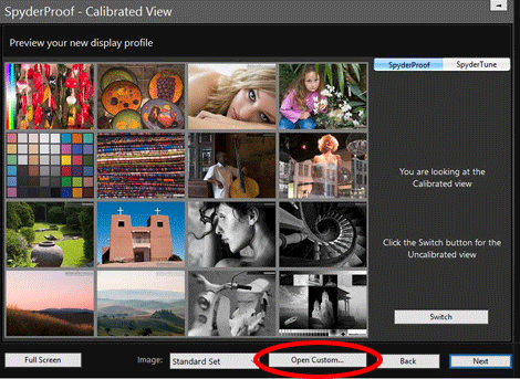
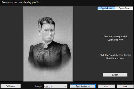
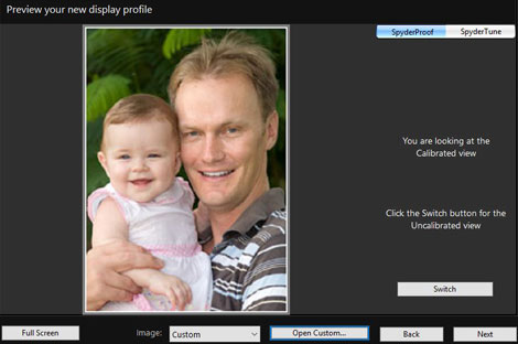
… and one at a time, you can open their files and compare the screen to the prints. Here are a couple of examples of photos I used:
I wish there was a way to flick between your five files more quickly – unfortunately, I haven’t found one. So allow a few minutes to go through all your files a few times, while holding their corresponding prints out to the side, and assess the result of the calibration. Don’t rush this part – take your time.
I have found, however, that you can drag-and-drop your image files from their folder onto the Spyder screen, which does speed things up a bit.
Note 1:
Remember that if any of your photos have extremely vivid colours in them (eg a bright turquoise dress, or a glowing orange sunset) those colours might be unprintable, and should be ignored when assessing calibration. Concentrate on the "normal/everyday" range of colours instead.
Note 2:
On the right-hand side of the screen there’s a "Switch" button which shows you the difference between the uncalibrated and calibrated state of your monitor. This might seem handy at first glance, and it’s fun to toggle for curiosity’s sake, but the truth is it has no relevance to the task of print comparison, so don’t spend too much time playing with it.
How is your calibration?
Click the link which best describes your screen:
- The brightness and colour are both perfect. A great calibration result.
- The brightness is really darn close to perfect. I can definitely live with it. And the colour is perfect.
- The brightness is perfect, or close enough to perfect for me. The colour is almost perfect, but I would love it if it was a tiny bit better.
- The brightness seems quite good, but the colour is not. It’s noticeably colder/warmer than the prints.
- The brightness isn’t right. It’s darker/brighter than the prints. But the colour, as far as I can tell, seems fine.
- The brightness isn’t right. It’s darker/brighter than the prints. And the colour doesn’t look right either, it’s colder/warmer than the prints. In short, it’s all wrong!
- This is my third or fourth time round to this damn page. I’ve tried everything you’ve suggested, and it’s still not looking right.